

Building Engaging Visual Content – The Illustrations
Building Engaging Visual Content – The Illustrations

Following last week’s studious post on ‘The Visual Influence for Engaging Content’ here at: https://outsideinlens.substack.com/p/the-visual-influence-for-engaging, this week Outside In compiles some of the Best Practices and Illustrations for building an influential (read: engaging) visual content – which should perhaps be a more fun read… Without much ado… Let’s straight jump In!
A Recap on Why Visual Content is Important
Both evolution and science sit behind the power of visual communications. Human beings remember and learn from images more successfully than text. Strong visuals can connect with an audience faster, and with more emotion, than words alone. Visual content dramatically improves ‘storytelling’ and human beings remember stories more effectively than any other content structure
It works because research suggests that we are far better at learning and remembering content we’ve seen in pictures than as text, a phenomenon known as the Picture Superiority Effect. There are several reasons why this occurs. One is that ‘picture stimuli’ embeds into memory twice, as both verbal code and as an image whereas words only generate a verbal code
5- Best Practices for Building Engaging Visual Content
1) Set Goals for Visual Content
A brand’s content strategy should guide its visual content. This means designing visuals that align with a brand’s quarterly and annual business as well as marketing goals. Marketers should seek answers for the following questions when goal-setting for visual content:
Who is the audience for this visual?
Does the content solve a user problem?
What is the purpose of creating and distributing this visual?
How does the visual align with the brand’s mission and vision?
What keywords will be included in the text?
Answers to these questions will help define metrics for examining the success of visual content creation
2) Use Branded Visuals
Visual content is one of the easiest ways to showcase a brand and build awareness for the company. After all, logos, fonts, and colors are the essentials of business branding. It takes between five and seven brand impressions online for a customer to recall a brand. So, adding branding elements to as many visuals as possible is a necessity
Check this piece for additional reading: 50+ Eye-Opening Branding Statistics 2023: https://www.smallbizgenius.net/by-the-numbers/branding-statistics/#gref
3) Give Visuals a Human Impact
Featuring people in a brand’s visuals is a great way to create viral marketing campaigns, like Coca-Cola’s 2020 Christmas ad that put people and not their brand at the center of their message
Check the Coca-Cola ‘Have yourself a Merry Christmas’ campaign here at:
4) Promote User Generated Content
Another way to create human impact is by incorporating user-generated content in visual marketing campaigns, like Cadbury’s ‘Go Madbury’ campaign which is live from 2019 onwards
Cadbury asked its consumers to invent their own variant of the bar. They would have to add ingredients that they feel would make their bar interesting. This campaign got a lot of attention. They also had a separate website for this campaign and people sent a lot of entries. The best one would be featured as the new flavor of Cadbury India
Check the Madbury launch campaign here at:
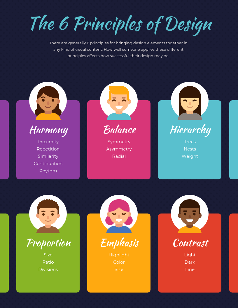
5) Follow Design Best Practices
Visuals need to follow graphic design principles. This way, imagery can be created that customers can immediately connect with. The graphic below explains what the top six design principles are:
Here are some other general rules to keep in mind:
Don’t overstuff visuals—maintain white space around elements
Keep color contrast and combinations in mind so the visual is more accessible
Use a maximum of three fonts—any more will make the copy confusing
Use image annotation tools to share design markups with collaborators via links
These principles of design will become easier to incorporate into visuals with practice and feedback
10 Tips for Impactful Visual Content, by PWC
Here are 10 tips from a PWC report “The Power of Visual Communication”, for creating and delivering impactful visual content
1) Consider your Content: What do you want your audience to know, feel and do? Are you trying to explain, explore or even persuade?
Explanatory visuals direct viewers along a defined path
Exploratory visuals, on the other hand, offer the viewer many dimensions to a data set, or compare multiple data sets with each other
2) Know your Audience
This rule is golden for all communications, not just visual design. Understanding where your audience is coming from, in order to influence where you would like to take them, is critical to selecting which visual device will be most effective. Reviewing the audience’s proximity on the change curve is one way of doing so

What If We Could Make the Future More Vivid – An Allianz Story
Allianz tried this by introducing people to their future self. They allowed individuals to upload a portrait of themselves into a portal, and using very inexpensive software, were able to ‘age’ the individual. The aged individual then exhibited different facial expressions based on their retirement income, e.g. upset if low retirement income. This simple visual communications tool developed by Allianz saw superannuation savings amounts double

3) Expand your Options
Visual design extends from the simplest static graphic, through to moving pictures and full immersion in an experience. Consider possible traditional, and emerging, visual design options. Landing the optimal solution should reflect a review of all visual styles and formats now available – traditional and emerging, physical and digital, experiential, virtual and augmented
4) Be Clever with Color
Elements such as personal preference, upbringing, cultural differences and context affect the impact colors have on us as individuals. When it comes to crafting visual communication messaging, the overall feeling, mood or personality reflected by an artefact’s color scheme is more important than any supposed emotional associations of the colors themselves. Is your palette in line with expectations around mood and tone? Does it reference a pre-existing corporate personality, position or values set?
5) Make It Stand Out, Not Apart
In a cognitive process known as the Distinctiveness Effect, humans are more likely to recall unique or unusual information. This means a new visual approach has greater chance of being remembered down the track than a more familiar one. While consistency has been linked to brand strength time and again, the standardization of every communications isn’t always ideal for engaging an internal audience. Relentless repetition of the status quo can result in fatigue and compromise engagement. Consider giving the design team a challenge to create a distinct identity or style within brand guidelines
6) Be Clever with Contrast
An item is more likely to be remembered when it stands out. This is a psychological phenomenon known as the Isolation Effect. In the world of e-Commerce, the use of bold design has been proven to deliver superior conversion rates. In a well-documented Button Color A/B Test of a ‘download now’ button, its impressive performance (21% improved conversion) was originally attributed to its vibrant red hue. Instead, subsequent analysis indicated its stark contrast to the surrounding environment to be the determining factor
One of the most vital, yet neglected, elements of corporate design is the use of white or negative space.
This is the space found inside and surrounding other design elements. As powerful as the silence between musical notes, the white space is like a canvas. The background that holds the elements together in a design enables them to stand out
With its power to influence action, the Isolation Effect is relevant to any visual communication, whether digital, physical or virtual
7) Own It
Where possible, use imagery unique to your organization. Whether it’s photography, a sketch or a digitally-designed icon, investing in the production of something new will not only reinforce the authenticity and professionalism of your communication, but cut through the clutter of ‘stock’ visuals that are too easy to ignore. Self-commissioned visuals will also display sharper strategic intent, have greater scope for usage across multiple platforms and allow infinite exclusivity
8) Involve the Audience
Taking the IKEA effect into consideration, allowing your audience to co-create a visual or visual style will make it theirs. Rather than serving up a visual approach, allow the audience some ownership and creative direction. Driving ownership through co-creation also gives your audience the power of choice. Choice architecture is the design of different ways choices can be presented and the impact of that presentation on decision-making. For instance, the number of choices presented, the manner in which attributes are described and the presence of a default can all influence choice
While traditional economics predicts that more options will generally improve consumer utility or leave it unchanged, offering too many can be equally dangerous. Known as choice overload, presenting a group with too many choices can lead to reduced motivation, and decreased satisfaction with choices once made. Mitigate choice overload by either limiting alternatives, or more strategically, including decision support tools alongside them. This can include design rationale and pros and cons associated with each visual style
9) Get Emotional
The value of appealing to your viewer’s personal needs, goals and overall care factor cannot be overstated. If you want your audience to think, feel or do something, design visuals accordingly. In the age of the #selfie, people are craving something that speaks to them personally. They want real, candid moments from everyday life – moments that speak to their human experience. Authentic imagery taps into the passions and emotions of your audience by letting them see something of themselves, turning them into advocates of the story you’re trying to tell
10) Move It for Meaning
Just as visuals can add new layers of meaning to text, motion brings new depth to visuals. Temporality, Tempo and Character can aid the comprehension and engagement with visual content. Motion tends to heighten our emotional responses to images. In a study comparing the responses of participants to moving and still versions of 27 different images, researchers found that picture motion significantly increased arousal. Picture motion also tended to prompt more heart-rate deceleration, most likely reflecting a greater allocation of attention to the more arousing images. Positive images were experienced as more positive and negative images as more negative when the image contained motion
Temporality: Motion can offer context and comparison to data. Showing a shift in graphs, images or data over time can bring trends to life through visuals that are engaging, easy to understand and more memorable than static comparisons
Tempo: Adding movement to content enables the controlled timing of information. Known as Predictive Coding, our brains actively predict what inputs are ahead, rather than passively processing information as it arrives. Controlling the sequence and tempo of visual information therefore heightens curiosity and engagement. When elements of the moving visual are building, the audience will look to fill any information gaps that surface. Using the moving components presented, viewers can connect the dots to land a conclusion themselves; feeling far more involved in the unfolding narrative
Character: Movement is a simple and elegant way to convey character. Principles for strategic visual communications can be used – applying smooth, organic motion for a human, empathic effect, while harsher, more direct motion conveys a sense of finality, security and control
From infographics to videos, strategy maps to storybooks, and scribed animations to quirky GIFs, visual content toolkits are now richer than ever. However it’s critical not to jeopardize the message integrity with ill-considered design. It is important to incorporate effective visual design in content and communications, and to understand the power of imagery goes well beyond ‘the pretty packaging
In Conclusion
The future of Visual Content in 2023 is likely to ‘visualized’ as follows:
Visual content has to be a focal point in any marketing strategy going forward, because of its strong relation with the human nature
The important impact of images and videos, along with the ease of today’s production of graphical content, are critical factors in favor of marketing engagement through visual content
Visual Campaigns will change the focus from Information to the Experience of the Customer
With a variety of visual presentations, brands can achieve the desired reach and recognition, making their marketing investments more efficient
Video is the popular content choice going forward – which will even see brands investing in their own video-first campaigns & platforms to host them all
References and Sources
1) Research Gate Paper – Marketing Engagement Through Visual Content: https://www.researchgate.net/publication/290084483_Marketing_Engagement_Through_Visual_Content
2) PWC Paper – The Power of Visual Communication: https://www.pwc.com.au/the-difference/the-power-of-visual-communication-apr17.pdf
3) 7 Types of Visual Content to attract Customers: https://flippingbook.com/blog/marketing-tips/best-visual-content-to-attract-customers
4) 50+ Eye-Opening Branding Statistics 2023: https://www.smallbizgenius.net/by-the-numbers/branding-statistics/#gref